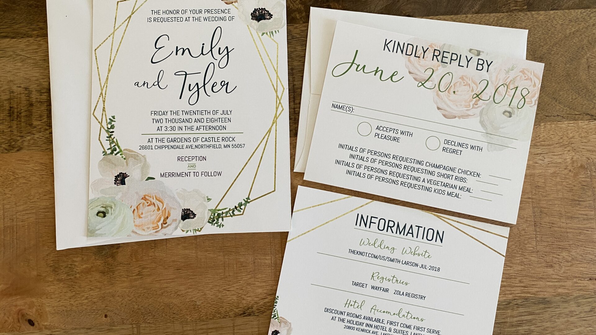
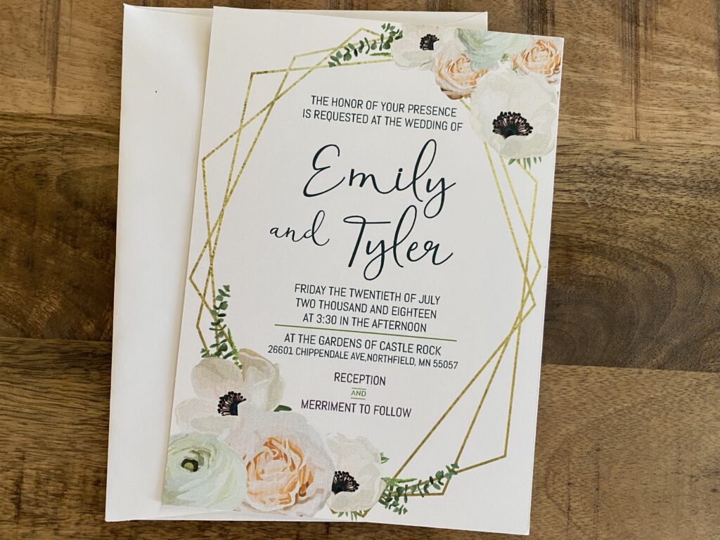
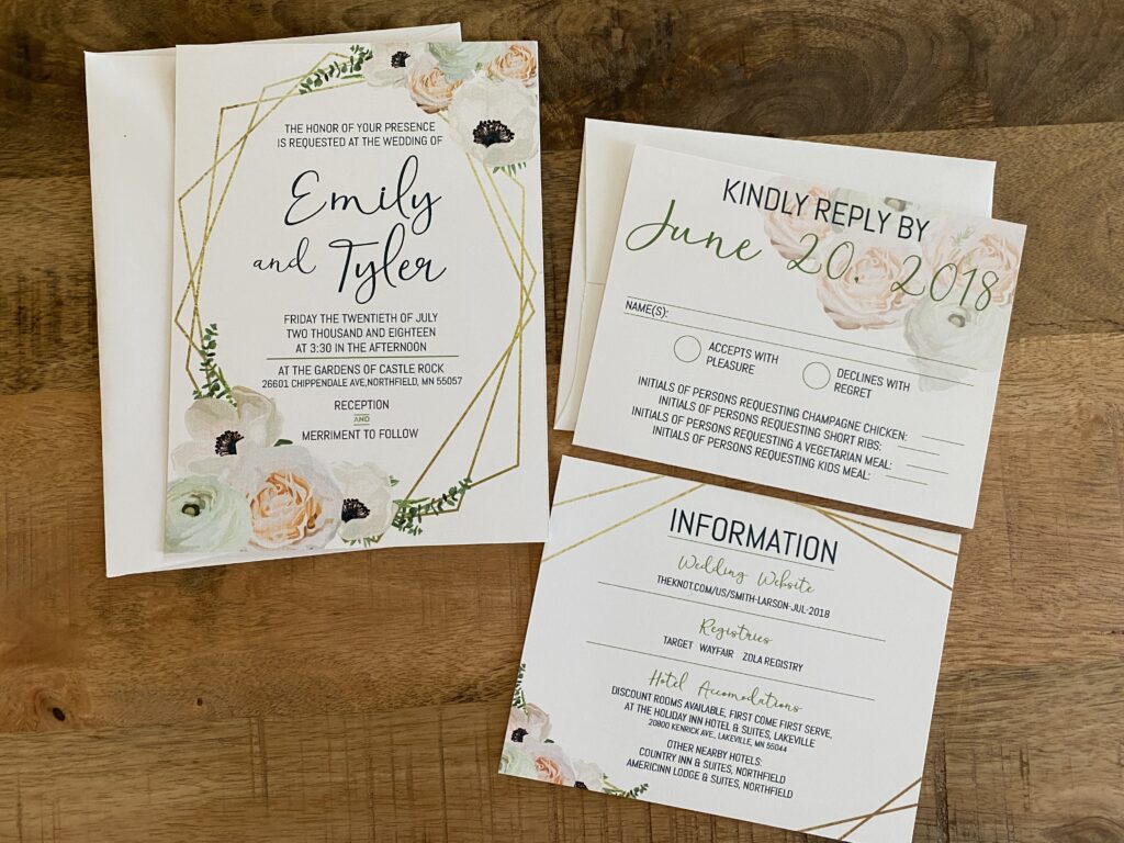
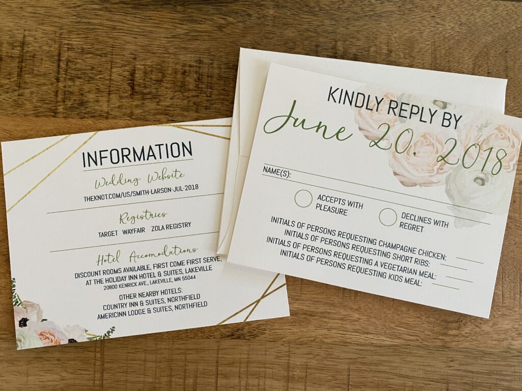
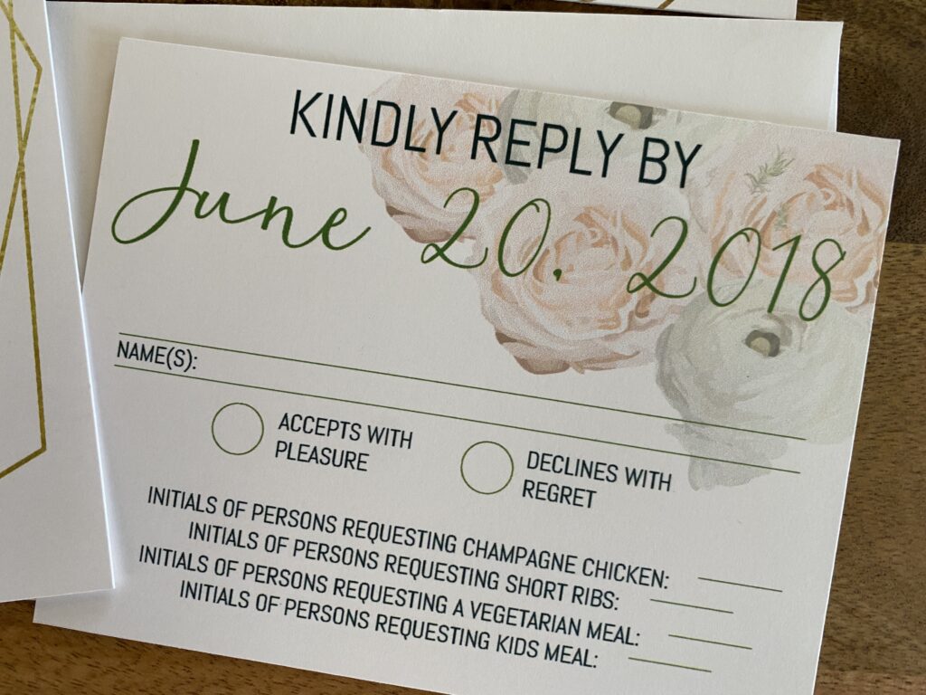
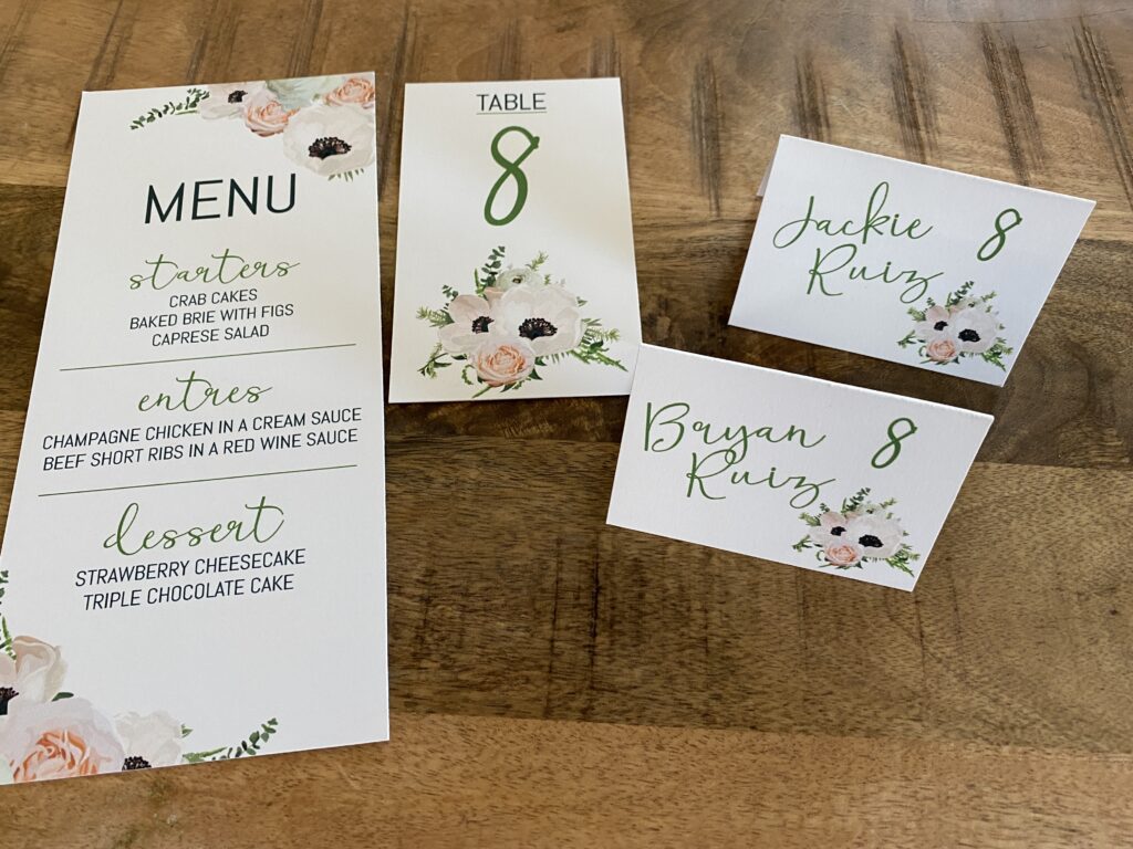
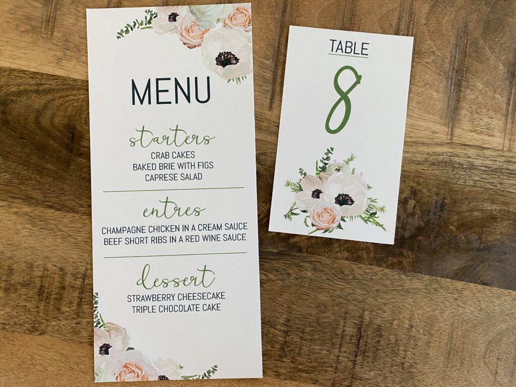
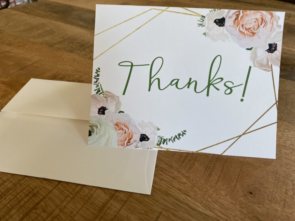
Geometric wedding invitations have been really popular lately. Eastlake Floral Design asked us to do a wedding invitation suite for a photo shoot. This wasn’t any ordinary wedding, however, it was a mock wedding to get some really great photographs showcasing their floral talents. They asked local vendors, like myself, to make certain things for the photographs. Direction Designs make the invitations, RSVP & information inserts, menu cards, place cards and thank you notes. This was an exciting project to partake in, because of the presence Eastlake Floral Design has in the community. I couldn’t pass up the chance.
First, Eastlake Floral didn’t give much guidance but they had a few ideas. They requested the wedding invites be light and airy while also bringing in gold and floral elements along with geometric patterns. I recently saw a geometric wedding invite that had always stayed in my mind. I suddenly want to redo my wedding invitations.
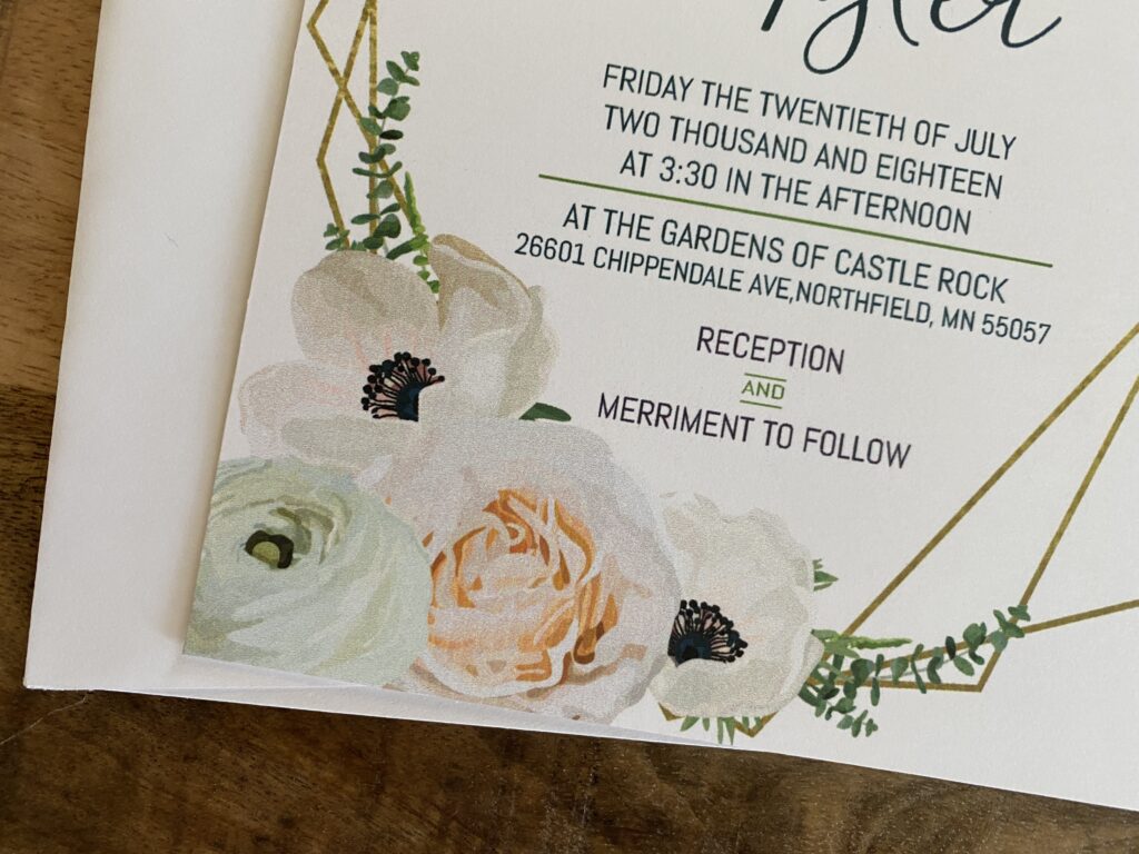
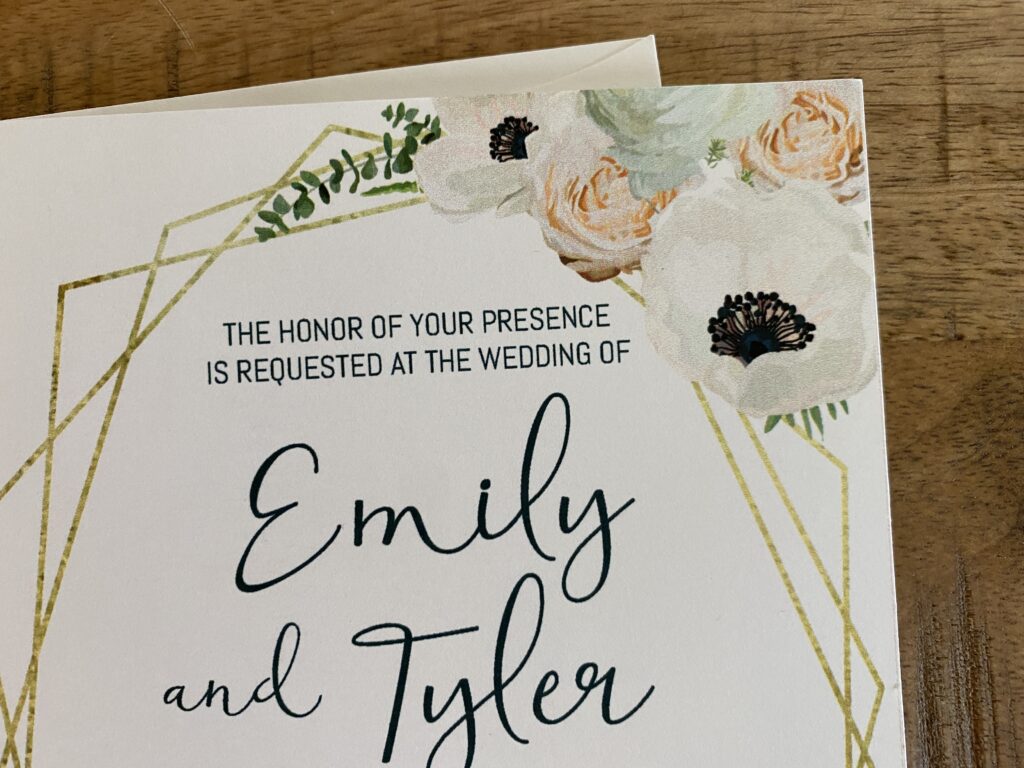
Next, I wanted the geometric wedding invitations to include some bright green elements, to keep with the fresh, floral idea. To me wedding flowers are always brilliant shades of colors and always have thick greenery to tie it all together. I wanted my design to have this same feeling.
Last, the hardest part was making the font elements organic yet structured. I chose a casual script font that I paired with a structured san serif font. I searched for an hour through my font book for the fonts I thought brought all the elements together. Once the text was in place, everything flowed so well together and created a very cohesive look.
Now, if you know me, I don’t like to stop at just one version. I did a few geometric wedding invitations variations. I stuck with the same gold and floral elements but played around with the placement of the text and fonts.
You can find these all in my Etsy shop! Also be sure to check out all of my designs here!
